
You present your training metrics to management—hours taught, budget spent, completion rates—without sparking any discussion. These metrics say nothing about the real issue: Do your operators know how to do their jobs, and will your site pass its next audit? In manufacturing, a useful training dashboard doesn’t look like a traditional HR dashboard: it combines certifications, versatility, actual hands-on time on the job, and compliance. Here are the Training Metrics and KPIs in the Manufacturing Industry that deserve a spot on your dashboard, and a sample layout for organizing them.
Why an industrial training dashboard is different from a traditional HR dashboard
A typical HR training dashboard is organized around three key metrics: how much is spent, how many hours of training are provided, and how many employees report being satisfied. This data justifies the budget but says nothing about productivity.
In an industrial setting, training addresses three key issues that do not exist anywhere else in the company. It is critical to safety, because an unauthorized operator cannot start a machine. It also determines compliance, as ISO 9001, IFS, FSSC 22000, NADCAP, or EN 9100 audits verify training records before granting certification. Finally, it impacts productivity, because an operator who is proficient in multiple workstations can cover for an absent colleague without disrupting the production pace.
This threefold challenge changes the nature of the KPIs to be tracked: the «training hours per employee» ratio becomes secondary. What really matters is the number of certified operators in critical positions, the number of certifications set to expire in 30 days, the cross-training rate per production line, and QHSE validation of temporary workers before they enter the site.
At Mercateam, we support more than 300 industrial sites, and we see the same pattern everywhere. The lifespan of an operational skill rarely exceeds three years before it needs to be reassessed. One-third of operators are over 55 years old, so knowledge transfer has become a management priority, not just a distant HR issue. Without a training dashboard designed for the factory, these warning signs go unnoticed until an audit or an unexpected absence brings them to light.
The four categories of indicators to be covered
A clear industrial training dashboard is built around four categories of metrics. Each one answers a different question, and none can be omitted without creating a blind spot in the management process.
Coverage: Who Is Covered and What Is Covered?
This is the descriptive layer of the dashboard: how many operators have been trained for each position, how long they’ve been trained, and what percentage of critical positions are covered. The KPI to track is not the number of training hours provided, but the percentage of operators certified for each position, ideally by production line or by workshop. A line where 80% of operators are certified does not maintain the same pace as a line with 100%, and this granular measurement directly influences decisions regarding the training plan for the following month.
Educational Quality: What Learners Take Away
Here, we measure whether the training actually achieved its goals: pass rates on immediate assessment quizzes, content engagement rates, and satisfaction rates. These indicators serve as early warning signs. If a module shows a 60% success rate on the quiz, the issue lies with either the content or the instructor, but there’s no point in sending 50 more people through it without first addressing the root cause of the problem.
Operational Transfer: What the Operator Can Do at the Workstation
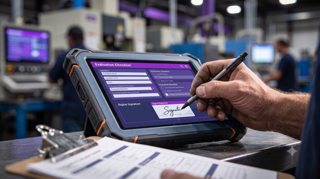
This is the most challenging category to assess and the most important one for the industry. It measures the gap between theoretical knowledge and proven on-the-job ability. To track it, a practical on-the-job assessment is required—in the form of a checklist signed by an evaluator following observation—not just a simple quiz. The key KPI is the practical pass rate compared to the theoretical pass rate: if the quiz has a pass rate of 95% but the practical assessment has a pass rate of 60%, your training program is teaching people how to pass the exam, not how to perform the job.
Compliance: Up-to-date clearances and audit ready
The fourth category, as determined by the audit: percentage of valid authorizations, number of authorizations expiring in 30, 60, or 90 days, and percentage of traceable electronic signatures. Without this module, you won’t know about the expirations until the month the auditor comes knocking, and the authorization tracking does not tolerate sloppiness.
The 5 Key Performance Indicators (KPIs) to Include in Your Dashboard
Beyond these four categories, five indicators consistently appear on the most useful dashboards in the factory. We see them championed by the training managers at our client sites because they show management whether training is generating operational value—where traditional HR KPIs fall short.
Pass Rate for Assessment Quizzes
Percentage of learners who achieve the minimum score on the post-training quiz, ideally broken down by module. This is the simplest indicator to implement and the most misused. A rate of 100% is not good news: it often means the quiz is too easy. A rate that drops to 70% for a module indicates either poorly calibrated content or a genuinely difficult topic that warrants more training time. The value of this KPI lies in its trend, not its absolute level.
Rate of Delay in the Training Plan
Percentage of scheduled sessions actually completed within the planned month: this is the key indicator of the health of the training management system. A rate that drifts to 30% is never a problem of operator motivation: it is either a shortage of trainers, production consistently encroaching on training time, or a plan that was unrealistic from the start. Without this KPI, you won’t discover the backlog until the audit flags expired certifications—by which time it’s too late to catch up.
Responsibilities of Instructors and Tutors
Number of sessions per trainer over the period, along with the deviation from the target set for each trainer. Sites that neglect this KPI burn out their subject-matter trainers, who eventually refuse new training assignments. The consequences become apparent only later: knowledge transfer grinds to a halt, and no one realizes it until an employee’s departure creates a skills gap in a critical position.
Actual on-the-job training time
The number of hours a trainee operator has actually spent at the target workstation, calculated based on the work assignment schedule. This is the metric that distinguishes an industrial dashboard from an HR dashboard. No traditional LMS measures this, because it requires cross-referencing training sessions with scheduling assignments to reconstruct hands-on practice time. At Mercateam, this cross-referencing is built right in: for each learner, we track the actual hands-on time spent at the workstation for which they are currently being certified. It is this KPI that validates or invalidates a training path. AFEST.
Training Content View Rates
The percentage of learners who access the content made available to them—whether it’s procedures, on-the-job instructions, or field videos—is a KPI that is consistently underestimated. In practice, educational content that isn’t accessed might as well not exist, and the data quickly confirms this. If you release a new procedure and 20% of the target audience has opened it three weeks later, you have a distribution channel problem, not a content problem. This KPI changes the game: the priority becomes making the content useful and accessible, not increasing the volume of training.
The Kirkpatrick Model Reimagined for the Industrial Sector
The Kirkpatrick Model, the academic standard for impact measurement, structures the evaluation of a training program across four levels: reaction, learning, behavior, and results. In most HR training dashboards, only the first two levels are fully supported: satisfaction rates (Level 1) and quiz scores (Level 2) are tracked. Levels 3 and 4 remain based on self-reporting.
In the industrial sector, Level 3 becomes directly measurable, because the transfer to the workstation is verified using a checklist signed by an evaluator following on-site observation. An operator trained to operate a bagging machine must demonstrate full proficiency, from startup to format change, including handling simple alarms and performing a safe shutdown. Until the checklist is validated, Level 2 certification is not sufficient to grant authorization.
Level 4 is also becoming tangible: the results of the training are reflected in production metrics you’re already tracking, such as the scrap rate on the line after a new setter has been trained, productivity per operator over the six weeks following their certification, or the frequency of unplanned downtime due to operator error. Cross-referencing these production metrics with certification dates provides a measure of impact that no back-office HR dashboard can produce. The Kirkpatrick model thus becomes operational on the factory floor, provided that the data is linked across the LMS, the training matrix, and the schedule.
What does a typical training dashboard look like in a factory?
A useful training dashboard fits on a single screen. Here is a typical layout found at the most mature industrial sites, organized into four sections.
Model
Browse the 4 sections of the dashboard
Top Banner, Compliance View
- 1
Percentage of Certified Operators in Critical Positions, by Line and by Workshop
- 2
Authorizations that expire in 30, 60, and 90 days, with a list of names
- 3
Versatility rate per line, calculated based on the versatility matrix
- 4
Percentage of the competency matrix that is up to date
Plan Control Block
- 1
Percentage of scheduled sessions that were delayed this month
- 2
Upcoming sessions over the next 30 days
- 3
Instructor workload per tutor
- 4
Number of operators currently undergoing the certification process
Educational Quality Module
- 1
Quiz pass rates by module, with an alert threshold of 70%
- 2
Content View Rate
- 3
Average Satisfaction (5-star rating or NPS)
Audit-Ready Block
- 1
Percentage of practical evaluations signed electronically
- 2
Traceability of Consents
- 3
Date of the last matrix export
Top banner, compliance view. It compiles the structural indicators that management and the audit team look at first:
- Percentage of certified operators in critical positions, by line and by workshop.
- Authorizations that expire in 30, 60, and 90 days, with an absolute number and a list of names.
- Versatility rate per line, calculated based on the versatility matrix.
- Percentage of the competency matrix that is up to date, as measured by the date of the most recent electronic signature.
Calculator
How versatile are you?
Enter the validated skills and the total number of tasks in the process for an operator, a team, or a line.
Versatility rate
60%
Plan Control Block. Rate of delays in this month’s scheduled sessions, upcoming sessions over the next 30 days, trainer workload per tutor, number of operators currently undergoing certification training. This section takes five seconds to read: you can see whether the month is on track or if the plan has already fallen behind.
Educational Quality Module. Quiz pass rates by module, content view rates, and average satisfaction (5-star rating or NPS), each with a clear alert threshold. A module with a pass rate below 70% turns red and triggers a content review before the next session.
Audit-ready block. Percentage of practical evaluations signed electronically, traceability of consents, date of the last matrix export. This module is used twice: the day before an audit to verify that we’re ready, and on the day of the audit to generate supporting documents with just a few clicks.
A monthly review by the training committee allows the plan to be adjusted and underperforming modules to be identified. At the Executive Committee meeting, a quarterly review covers the top-level KPIs and projections for critical certifications. The export for audit purposes is done on demand, with just a few clicks. This approach transforms the dashboard from a mere formality into a key reference consulted by industrial management. The dashboard never includes more than eight key KPIs; beyond that, it becomes unreadable, and the training department risks losing the attention it has begun to gain.
The Pitfalls That Make a Dashboard Unusable
Many training dashboards end up in a shared folder that no one ever opens. The reasons are almost always the same, in the same order.
- Too many metrics. If there are more than eight key performance indicators (KPIs), the data becomes impossible to interpret, and no one takes ownership of the tool.
- Non-actionable KPIs. The number of training hours per employee does not trigger any decisions. If a metric cannot be followed up with immediate action, it does not deserve a spot in the header.
- Data disconnected from the schedule. A dashboard that doesn't track who is at which station at any given time cannot measure actual practice time or anticipate when shifts end.
- Lack of alert thresholds. A KPI without a defined threshold merely reports data. With a threshold, it triggers a review, a reassignment, or a reminder.
- No breakdown by production line or workshop. A site-wide average masks critical discrepancies between one line with 95% certifications and another with 60%, which will not pass the audit.
- Manual update. A dashboard that’s updated manually quickly becomes inaccurate. Data must be pulled automatically from the LMS, the schedule, and the skills matrix.
Diagnosis
Is your dashboard audit-ready?
Check the situations that apply to you today.
0 out of 6 traps checked
A robust dashboard that's pretty much audit-ready.
How can you transition from Excel to automated management?
Excel has one advantage: it forces you to structure your metrics before investing in a tool. It also has limitations that become apparent as soon as the scope exceeds about fifty operators. Authorizations expire without triggering any alerts, electronic signatures aren’t available, and there’s no link to the assignment schedule, which makes actual practice time invisible. Added to this is the need for manual maintenance, which creates a bottleneck and increases the likelihood of data entry errors.
Automated monitoring isn’t just a gimmick—it’s essential for tracking operational transfer and compliance KPIs with reliable data. The dashboard integrates with the competency matrix, the schedule, the LMS, and practical assessments. Every action taken at a workstation updates the data without requiring additional data entry, and the training follow-up becomes a daily habit rather than a monthly catch-up.
That's exactly what we're building at Mercateam with our clients' industrial sites. To see what an automated industrial training dashboard looks like for your specific needs, request a personalized demo.
Comparison
Excel or automated management?
No automatic alert when an authorization is about to expire
Electronic Signing of Practical Assessments Unavailable
No connection to the assignment schedule: actual practice time remains hidden
Manual update: bottlenecks and data entry errors
Automatic alerts 30, 60, and 90 days before authorization expirations
An electronic signature is affixed to each practical evaluation
Data linked to the schedule: the actual time spent on each task becomes visible
Automatic updates from the matrix, the schedule, the LMS, and assessments